In a short series from the LuxLab at Luxonic Lighting, the technical background of some of the more familiar terms when talking about selecting and specifying lighting are explained in detail. Divided into the broad areas of ‘Ways of Producing Light’, ‘Light Quality’, Light Distribution’ and ‘Light Fittings’. This is the second article, focusing on ‘Light Quality’.
There are many ways of generating white light. The various methods (including incandescence, fluorescence, discharge and colour mixing) use a variety of processes to generate a range of colours that mix together in a balance that humans perceive, to a greater or lesser extent, as white light. The fundamental goal of artificial general lighting is of course to allow humans to move around a space without bumping into things or mistaking a closed door for an opening into a dark corridor. Still fairly basic is the requirement for colours to be recognisable and vivid. A desirable quality of a light source is that it should allow skin tones to appear natural and not give the erroneous impression that the occupants of that particular space are suffering from some unfortunate skin condition or lack of basic nutrition.
Colour Temperature
Even true ‘white’ light isn’t always the same colour. Commonly described as ‘cool’ or ‘warm’, or more precisely specified as ‘5300 K’ or ‘3000 K’, colour temperature can be crudely described as how orangy or blueish the light is. It is based on the principle that a hot thing glows red and a very, very hot thing glows white – and scientists habitually measure temperature in Kelvin rather than Celsius or Fahrenheit. The lower the Kelvin value, the more orange the light emitted appears. Perversely, light said to be ‘cool’ is given the highest (hottest) Kelvin value – perhaps the way to remember it is ‘blue light – the Arctic – cold and fresh’ and ‘orange light – deserts – warm and cosy’.
‘Warm White’ directional LEDs with ‘Cool White’ ambient light from the side panels.
Correlated Colour Temperature (CCT)
Strictly speaking only incandescence can have a colour temperature assigned to it, but clearly other ‘white’ light sources can appear either cool or warm. In these cases we can assign the light source a rating that roughly correlates to a genuine colour temperature. This approximation is the reason that 4000K fluorescent lamps from different manufacturers can look strikingly different when used side-by-side in the same luminaire.
Chromacity Coordinates
A far more precise way to define the colour appearance of a light source is by using the chromacity coordinates. The CIE chart below shows all the colours and shades of light humans can perceive, by using a simple coordinates system an exact colour can be very tightly defined. It is clear to see that there is quite a large part in the middle that could reasonably be described as ‘white’
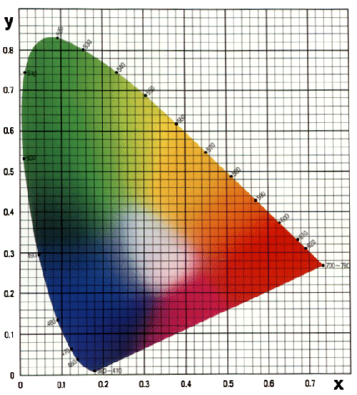
The CIE 1931 Colour Space
MacAdam Ellipse and Standard Deviation of Colour Matching (SDCM)
The eye is very sensitive to small variations in white light. White light sources need to be carefully matched to avoid a patchy looking installation and the SDCM value is the way to ensure this. One SDCM is defined as a variation in light colour that is just noticeable in laboratory conditions. It is generally accepted that three step SDCM consistency will not be perceptible in a normal general lighting installation, five step SDCM is probably going to be OK, seven step is about as far as you would want to push it without expecting complaints.
Colour Stability
Colour shift over lifetime happens with most sources to varying degrees, fortunately it is generally always in the same direction within an installation using the same light source. Differences in colour between light sources are what will cause complaints, but extreme colour shifts could give an overall green or pink hue to a lit space and this would clearly be an issue.
Colour Rendering (Ra)
The balance of colours within a white light source doesn’t only affect the appearance of the light, it affects the appearance of the things the light lands on. Yellow light can be made up of, well, yellow light – but it can also be made up of just red light and green light mixed together. A yellow lemon may well only reflect yellow photons, if it was lit with a mixture of red and green photons it wouldn’t have anything to reflect! It would appear dull and brown – and nobody wants to buy dull, brown lemons. This is the basis of colour rendering – the goal is to accurately reproduce colours in the way they appear when lit by sunlight, often expressed in the format Ra 80 or Ra 90 where Ra 100 is the ideal.
Having said all this, a quality lighting installation is not just about having good quality light. Arguably more important is getting the right light in the right place, and nothing that would be a source of glare, cause problems for computer users, contravene guidance from LG3 and LG7, lead to inefficient installations.
